Web
What a museum website owes its visitors
Museum websites often try to be the exhibition. Visitors mostly want to know when it's open and whether they can bring the pushchair. Notes from building the site for Tidewater's Low Water.
 Ilse Brandt, Design lead, digital3 min read
A good exhibition takes years to make. The curators know every object, every story and every loan agreement behind it. It’s natural that they want the website to show all of that.
But the people who visit a museum’s website are mostly in a different mood. They’re deciding whether to go, and if so when, with whom and how. When we built the site for Low Water, Tidewater Museum’s exhibition about flooding, we started from that gap. I think it applies to most museum and gallery sites, so here’s what we learned.
Read the front-desk log
Before writing anything, we asked the museum for its front-desk log from the previous year. Like many museums, Tidewater records phone and desk enquiries in a simple spreadsheet. It had a little over 3,000 entries.
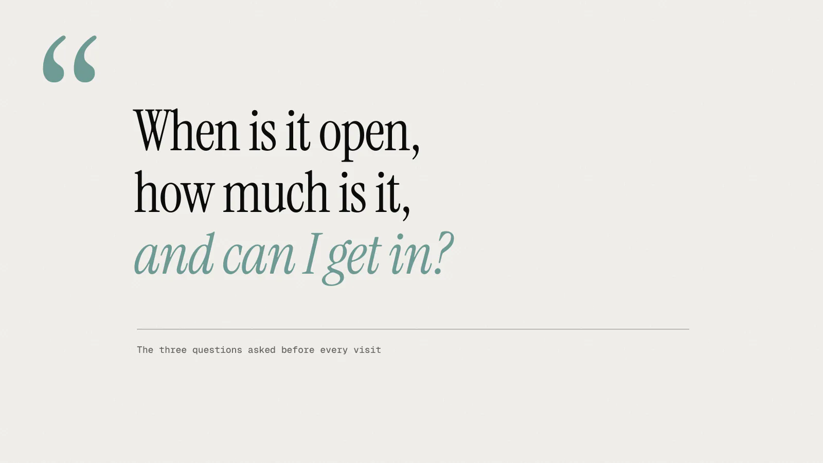
We sorted them into groups. Nearly all were practical:
- opening hours and holiday closures
- whether the building is step-free and where the lift is
- pushchairs, wheelchairs and mobility scooters in the galleries
- parking, and how far it is from the station
- how long a visit takes, especially with children
- whether tickets need to be booked in advance
Fewer than forty entries asked about the content of an exhibition. Nobody phoned to ask what a particular object was.
That spreadsheet did more to shape the site than any workshop. It’s the most honest research a museum already has, and it’s free.
Put the visit first
The first page of the Low Water site is the visit page. On a phone, the first screen shows the dates, today’s opening hours, ticket prices and a button to book. Directly below that is access: step-free entrance, lift, pushchairs welcome, seats in every gallery, a quiet room, and where the accessible toilets are. Then how to get there and how long most visits take.
The curators were uneasy about this at first. It felt like leading with the small print. We showed them the front-desk log and agreed that the stories would come next, not hidden, just not first.
A visitor who arrives knowing where to park and how long to allow is in a much better state to enjoy the exhibition.
Write less, then link to more
The curators had written about 30,000 words for the exhibition. That’s a lot to read on a phone. We went through it with them story by story and chose twelve objects that worked well on screen, each with a story of around 600 words and two or three images.
The longer texts went into the printed gallery guide, where people read them sitting down in the galleries, which is a better place for them. Nothing was lost; it went where it would be read.
Each story ends with where the object is in the building (“Room 3, by the window”) so the site also works during the visit. That turned out to matter more than we expected.
Make it fast where the signal is bad
Tidewater is on the coast, and mobile signal around the museum is patchy. Many visitors look at the site on a phone in the car park or the café. We built the site as static pages with very little JavaScript, compressed every image and tested on a mid-range Android phone over a throttled 3G connection throughout the project. The median page now loads in under a second on mobile.
We left out most of what museum sites usually carry: no autoplaying video, no cookie banner (there’s nothing to consent to, because there’s no tracking beyond simple page counts), and no newsletter pop-up.
What happened
The exhibition opened in October 2024. Advance bookings were 19% higher than for the museum’s previous major exhibition, and calls about access and facilities fell by almost half.
The story pages did better than the curators had feared. About a third of visits to them happened after people had been to the museum, often the same evening. People went home and read more about the things they’d seen. That’s a better result than a website that tries to replace the visit, and I think it’s the right order: practical questions first, then the stories for anyone who wants them.
A short checklist
If you’re planning a museum or gallery site, these are the questions we’d ask first:
- Can someone find today’s opening hours within five seconds on a phone?
- Is access information on the main visit page, not on a separate page?
- Does the site load quickly on a weak mobile signal?
- Do the stories tell people where to find the object in the building?
- Has someone read the front-desk log?
None of these are design questions, strictly speaking. They’re the ones that make the design work.