Wayfinding
Signage at walking speed
A person walking through a station gets about two seconds with each sign. What that does to type sizes, word counts and where signs go, from our work on Northline's 31 stations.
 Sanne Vermeulen, Co-founder, creative director4 min read
People don’t read signs. They glance at them while doing something else: walking, carrying a bag, holding a child’s hand, looking for a ticket. Any sign that only works when someone stops in front of it has already failed most of the people who need it.
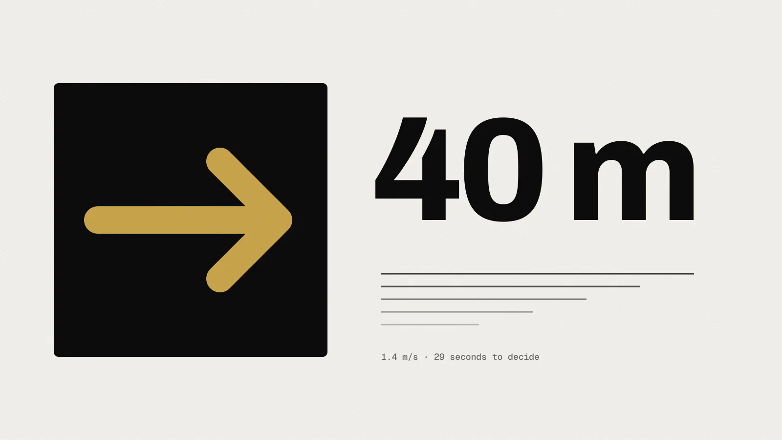
When we started on Northline Rail’s wayfinding in 2024, we spent three weeks watching how people used the old signs before we drew anything. Most of what we learned comes down to one figure: at walking pace, you get about two seconds.
Measuring the glance
Two of us stood on platforms and in ticket halls at eleven stations, at rush hour, midday and late evening. We timed how long people looked at a sign and noted where they slowed down or stopped to ask someone.
The numbers were consistent across stations. People walked at around 1.4 metres per second. Glances at overhead signs lasted between one and two and a half seconds, with most under two. People who looked for longer than three seconds usually stopped walking, and a good share of those then asked a member of staff.
So the question for every sign became: what can someone take in, from where they are, in under two seconds?
What two seconds allows
Not much. In practice it’s one decision. A sign can tell you which way to your platform, or which exit leads to the buses, but it struggles to do both. On the old signs we found one panel listing seven destinations, two exits, the toilets, a lift and the ticket office. People looked at it and then looked for a person.
We wrote some limits into the guidelines:
- no more than three destinations on a directional sign, each with its own arrow
- one name for each place, used identically on every sign, in the app and in announcements
- exits are letters (A, B, C), which take a fraction of the time to read that street names do
- pictograms only where they’re widely understood; we kept seven and dropped the rest
Sizing type for distance
Type size follows from where the reader is when they need to decide. A sign at the top of an escalator is read from perhaps ten metres. A platform number might be read from the far end of the train. We used working figures from our own tests with full-size card mock-ups, which came out slightly more generous than most published guidance:
| Reading distance | Cap height | Typical use |
|---|---|---|
| 3 m | 15 mm | Timetables and maps at eye level |
| 10 m | 40 mm | Directional signs in corridors |
| 25 m | 100 mm | Overhead signs in ticket halls |
| 50 m | 200 mm | Station names on platforms |
| 120 m | 240 mm | Platform numbers (numerals only) |
The last row breaks the pattern on purpose. A single large numeral is recognised from much further than a word, because there’s only one shape to make out. That’s why the platform number on Northline’s signs is the biggest thing on them, bigger than the station name.
These are figures for high contrast, dark text on a light panel or the reverse, under decent lighting. In a dim underpass, or with a panel facing a low winter sun, we went up a size.
Where the sign goes
Placement matters as much as size. A sign placed after the decision point is useless, and one placed too early is forgotten by the time it matters. We marked every decision point on a plan of each station, such as the bottom of a stair or a corridor junction, and put the sign where people could see it about four or five steps before they reached that point.
The best sign is one that appears just as you start to wonder which way to go.
This also meant removing a lot of signs. Northline’s busiest interchange had 140 sign faces before the project and has 86 now. Fewer signs means each one is easier to spot, and nobody has complained about not finding their way.
Testing it
We printed full-size mock-ups on foam board and hung them at two pilot stations for a fortnight before ordering anything from the fabricator. We repeated the timing exercise with the mock-ups in place. The share of people stopping to look for longer than three seconds fell by about half.
Some mock-ups didn’t survive. A version of the exit signs that put the street name beside the letter tested worse than the letter alone; people read the street name and slowed down. It’s now on the station maps instead, where people have time to read it.
What we took from it
The two-second rule is useful outside stations. Shop fascias, museum entrances and directions in a hospital all get read at walking speed. When we designed the signs for Pell Bakery’s three shops, the main test was whether you could read the name from the tram stop across the road while the tram was pulling in. It’s a better brief than “make it visible”, and you can check it with a stopwatch.