Design systems
A design system for a team of four
Most design system advice assumes a platform team. Fenwick Health's digital team is four people. What we left out, what we kept, and the forty tokens that hold it together.
 Ilse Brandt, Design lead, digital4 min read
When we finished Fenwick Health’s patient portal last year, part of the job was to leave behind a design system. Fenwick’s digital team is four people: a product owner, a designer and two developers. They also look after the clinics’ public website and a handful of internal tools.
Most of what’s written about design systems comes from large companies with a dedicated team to look after one. That advice doesn’t transfer well to a team where everyone has three other jobs. A system that needs maintaining is a system that four busy people will slowly stop using.
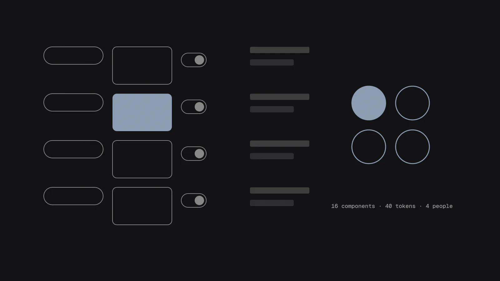
So we set ourselves a rule: the system should be small enough to fit on one sheet of paper. It ended up as 14 components and about 40 tokens.
Build the product first
We didn’t start with the system. We designed and built the portal first, with a loose set of styles, and only pulled the system out once the screens had settled. That way, everything in it had already been used at least once in a real flow with real patients.
It’s tempting to design the button component before you know how many kinds of button you need. In the portal we needed two, a primary action and a quiet secondary one. A system designed up front would almost certainly have had five.
What’s in it
The 14 components are the ones the portal actually uses:
- button, link and icon button
- text field, select, radio group, checkbox and date field
- alert, card and list row
- page header, step indicator and the site footer
There’s no modal, no tooltip, no carousel and no tabs. The portal doesn’t need them, and several of them are hard to make accessible for the patients who use it. If Fenwick needs one later, they’ll add it then, with a real use in front of them.
Forty tokens
The tokens are where a small system earns its keep, because they’re shared by design files and code. We kept them flat and named them by purpose, not by appearance. Here’s a slice of the file:
{
  "color": {
    "text": { "value": "#1B1D1F" },
    "text-muted": { "value": "#4A4F55" },
    "surface": { "value": "#FFFFFF" },
    "surface-sunken": { "value": "#F3F4F5" },
    "action": { "value": "#0A5C7A" },
    "action-text": { "value": "#FFFFFF" },
    "focus": { "value": "#F2B300" },
    "danger": { "value": "#A3261B" },
    "success": { "value": "#1E6B3A" }
  },
  "font": {
    "size-body": { "value": "18px" },
    "size-body-large": { "value": "20px" },
    "size-heading": { "value": "28px" },
    "line-body": { "value": "1.55" }
  },
  "space": {
    "1": { "value": "4px" },
    "2": { "value": "8px" },
    "3": { "value": "16px" },
    "4": { "value": "24px" },
    "5": { "value": "40px" }
  },
  "radius": { "control": { "value": "6px" } },
  "focus-ring": { "value": "3px solid {color.focus}" }
}
A few choices are worth explaining. There’s no colour scale, no blue-100 to blue-900. A scale invites people to pick shades by eye, and every new shade is one more thing to check for contrast. Every colour here has been checked against the surfaces it sits on and passes WCAG AA, most of them comfortably.
The body size is 18 pixels, with a 20-pixel option that patients can switch on. We found in testing that many older patients had their phone’s text size turned up already, so the layouts were designed at the larger size first and checked at 200% zoom.
There are only five spacing steps. Fenwick’s designer told us later this was the thing she was most sceptical about and now likes most, because it ends the discussion about whether something should be 12 or 14 pixels.
Documentation people read
The documentation is a single page per component, each with the same four headings: when to use it, when not to, how it behaves with a keyboard and a screen reader, and an example from the portal. Most pages are under 300 words.
If a rule needs a long explanation, it’s usually a sign that the component is doing too much.
We wrote the “when not to use it” sections with particular care. They’re the ones that stop a system from drifting, and they’re the ones people look for when they’re unsure.
Handing it over
We didn’t hand over a document and leave. For the first two features Fenwick built after launch, repeat prescriptions and test results, one of us paired with their designer and one of their developers for two days a week. They built, we answered questions and fixed the gaps in the documentation as they came up.
By the third feature they didn’t need us. Six months after launch, the system has 16 components, two more than we left. Both were added by Fenwick’s team, documented in the same format, and both are things the portal genuinely needed. That’s what a healthy small system looks like: slow, careful growth by the people who use it.