Type
The type specimens we keep coming back to
A shelf of old sample books, printers' catalogues and foundry sheets in the Lisbon studio, and what they still teach us about choosing and testing type.
 Duarte Leal, Co-founder, design director3 min read
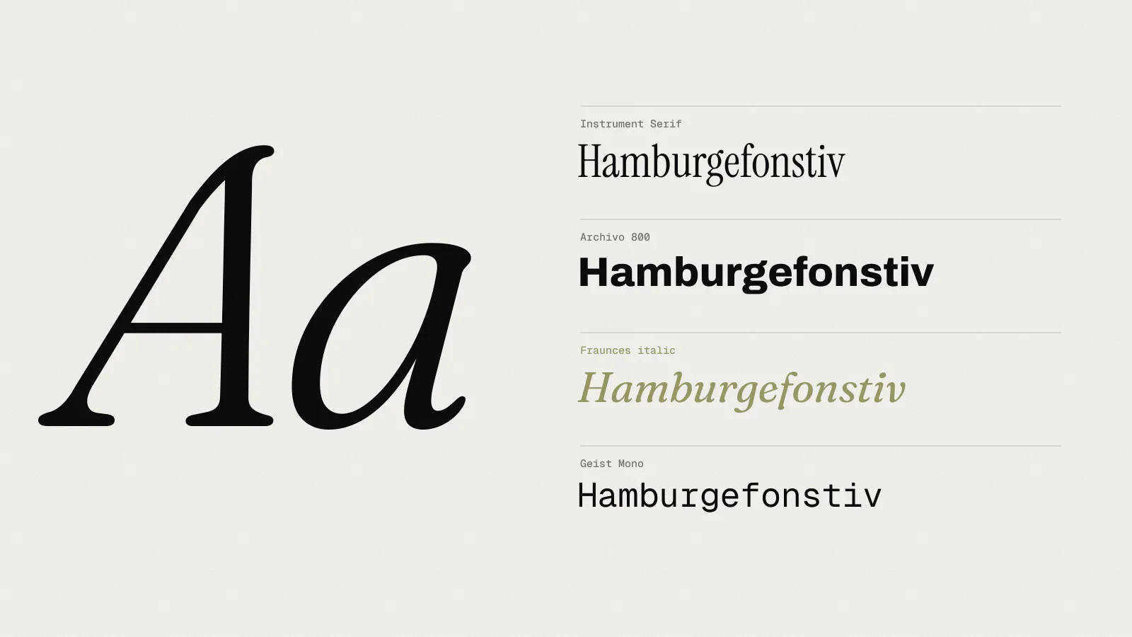
There is a shelf in the Lisbon studio, about two metres long, that holds our type specimens. Some were bought at markets and second-hand bookshops, some were given to us by retired printers, and a few were sent by type designers we’ve worked with. Nobody needs a physical specimen to choose a typeface any more. We still take them down every week.
This isn’t a list of favourite fonts. It’s about what good specimens do, and why looking at them makes us better at choosing type for clients.
A printer’s sample book from 1958
The oldest thing on the shelf is a sample book from a small printing firm in Haarlem, bought for €12 at a market in 2016. It’s about 120 pages, cloth-bound, and shows every typeface the printer had in metal, at every size they owned.
What makes it useful isn’t the typefaces. It’s that every one is shown doing a job. There’s a menu, a funeral notice, a wedding invitation, a price list for bicycle parts and a page of timetable. You see each face at the size and in the setting it would actually be used.
That’s the test we try to apply to every typeface we consider for a client. Not the alphabet, not a pangram, but a real menu, a real label, a real platform sign. A typeface that looks beautiful as a single headline can fall apart in a price list.
Specimen sheets from the 1960s and 70s
We have around thirty loose specimen sheets, mostly from transfer lettering catalogues and typesetting firms. They’re printed fast and cheaply, and many show their typefaces at only three or four sizes.
They’re good at one thing: showing a typeface’s character at a glance, when there’s little time to look. That makes them a useful reminder for identity work. A wordmark gets about as much attention as one of these sheets, a second or two. If the typeface’s personality doesn’t come through in that time, no amount of careful kerning will fix it.
Contemporary specimens
The newer specimens are from type designers we’ve licensed fonts from for client work. Most are printed booklets, and the best of them are more like small books than catalogues.
The good ones share a few habits:
- they show the typeface at text sizes, in long paragraphs, not just in headlines
- they include numerals, fractions and currency signs, which clients always need and specimens often skip
- they set the typeface in more than one language, including ones with accents and different word lengths
- they show weights side by side, so you can judge the steps between them
The third point matters to us more than most. Corvel works in Dutch, Portuguese and English every week. Dutch has long compound words that wreck tight headlines. Portuguese has a lot of accented capitals, and some typefaces handle them badly. A specimen that only shows English tells us very little.
The best specimen is the one that answers the question you’d otherwise have to set up a test to find out.
What we do with them
When we start choosing type for an identity, we pull out three or four specimens that are close to what we think we need and spread them on the big table. We look at them together, as a team, for half an hour. It’s a much better way of narrowing down than scrolling through a type foundry’s website alone.
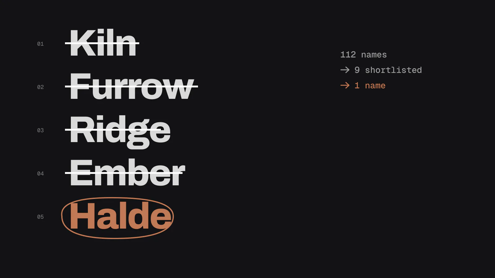
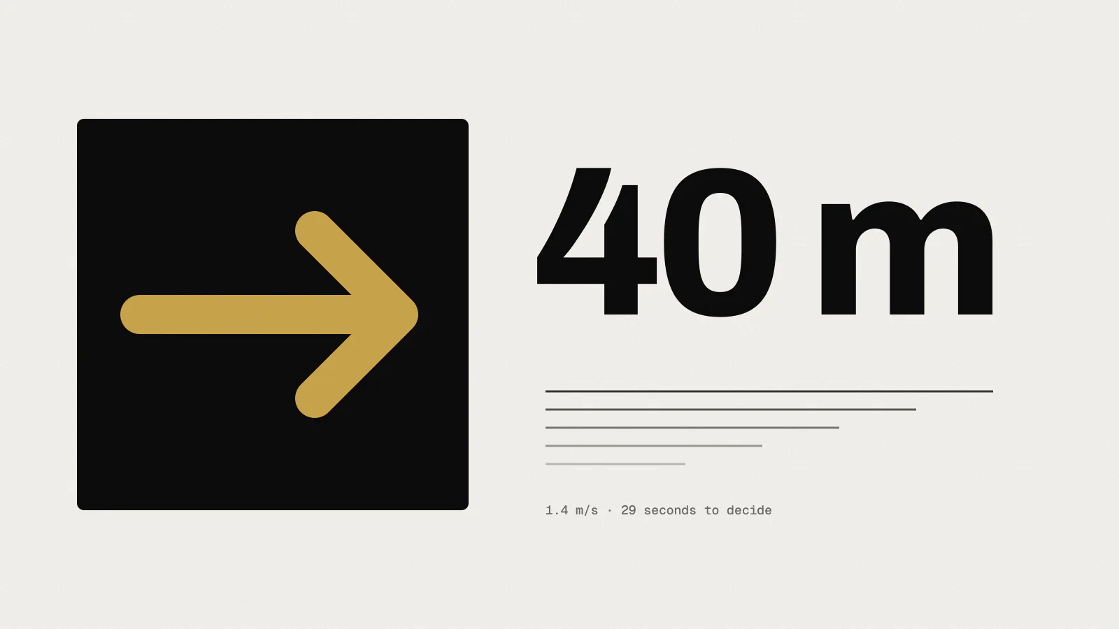
Then we make our own specimen for the client. It’s a short booklet of eight to twelve pages that shows the shortlisted typefaces doing the client’s actual jobs. For Halde, that was a coffee label, a wholesale invoice and a page of the web shop. For Northline, it was a platform sign at full size, printed in sections and taped together on the studio wall.
Clients find these much easier to judge than a list of font names. They can see their own words, at their own sizes, and pick the one that looks like them.
A note on buying them
If you want to start a collection, second-hand markets and printers’ clearance sales are still the cheapest places to look. We’ve never paid more than €40 for anything on the shelf. Ask older printers too. Several of our best specimens came from people who were glad to see them go to someone who would use them.
Our shelf is open to anyone who visits the Lisbon studio. Bring a question about a typeface, and we’ll find something to show you.