Northline Rail
Wayfinding and an app for a regional line with 31 stations
A sign family that can be read at walking speed on a dark platform, and a journey app built on the same names, numbers and arrows.
- Client
- Northline Rail
- Year
- 2025
- Services
- Wayfinding, signage, app design, research
- Team
- 5 designers, 1 researcher, 2 developers
- Timeline
- 14 months, pilot to roll-out
The brief
Northline runs a regional line of 31 stations, from two busy interchanges to small halts with one platform and a shelter. Over twenty years each station had collected signs from different suppliers and campaigns. On the first survey we counted 23 sign types, four versions of the logo and three different words for the same exit.
The operator wanted a sign family it could roll out station by station, and a new journey app to replace one built by a contractor in 2016. Both were to launch in 2025.
What we did
We started on the platforms. Over three weeks two of us visited eleven stations at different times of day, timed how long people looked at signs and noted where they stopped to ask. Most questions were the same four: which platform, which exit, where’s the bus, and is this train mine.
From that, we set out some rules before drawing anything:
- one name per place, the same on every sign, in the app and in announcements
- exits get letters (A, B, C), not compass points or street names
- information appears where the decision is made, not earlier “just in case”
- signs are sized for reading at walking speed, about 1.4 metres per second
The last rule decided most of the type sizes. A walking reader gets roughly two seconds with a sign, so the destination and the arrow have to be readable in that time from the distance at which they need to turn. We built full-size mock-ups in card and tested them at two pilot stations before anything went to the fabricator.
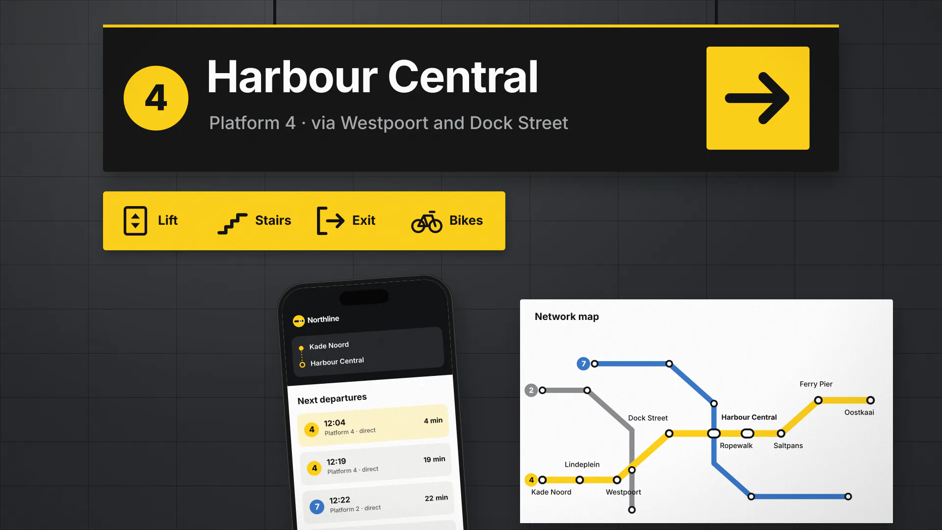
The app came second and borrowed everything it could from the signs: the names, the exit letters and the arrows. Journey screens show the platform number at the same weight as on the platform sign, and each station has a simple map with the exits marked by letter. We designed it with Northline’s two in-house developers, who built it in React Native.
What changed
The pilot stations went live in March. Over the following three months, staff at those stations logged 24% fewer wayfinding questions than in the same period the year before. The rest of the line followed by November.
The new family has eight sign types where there were 23, which also simplified maintenance: Northline now keeps spares of each type instead of reordering one-offs. The app holds an average rating of 4.6, and the most common request in reviews is for live platform changes, which is in development.
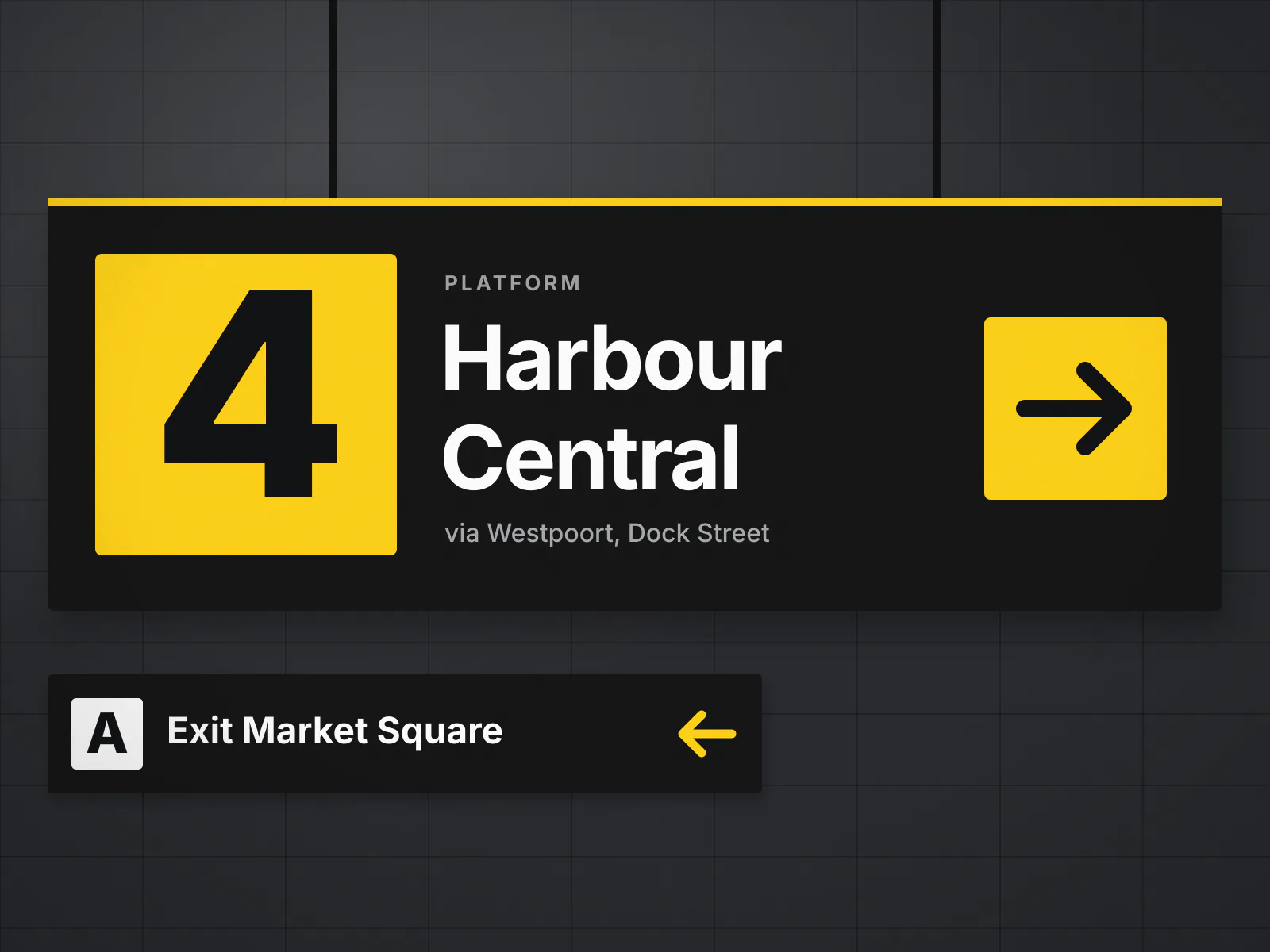
Platform numbers are set at 240 mm so they can be read from the far end of a 120 m platform. 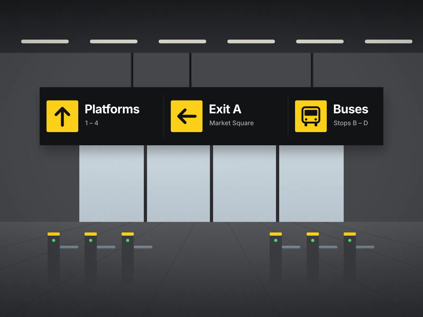
At entrances, one sign answers the three most common questions: platforms, exits and buses. 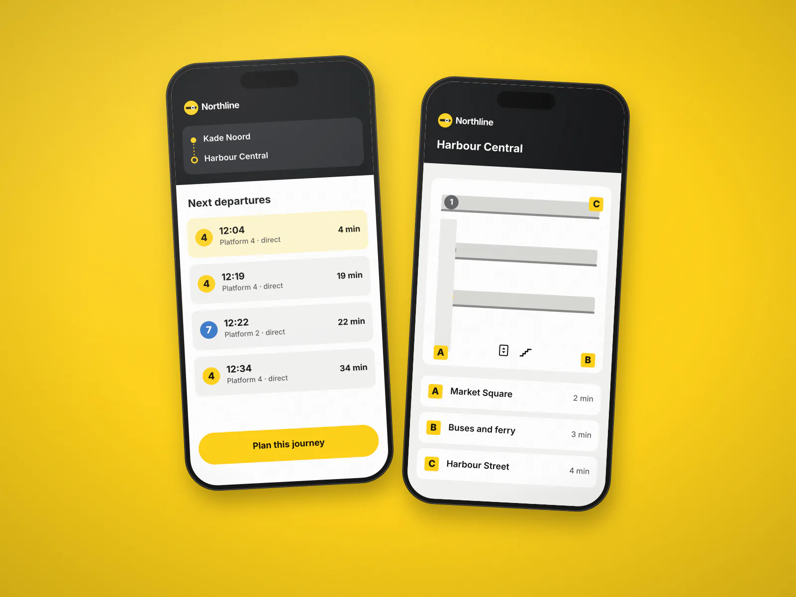
The app uses the same platform numbers, exit letters and arrows as the signs. 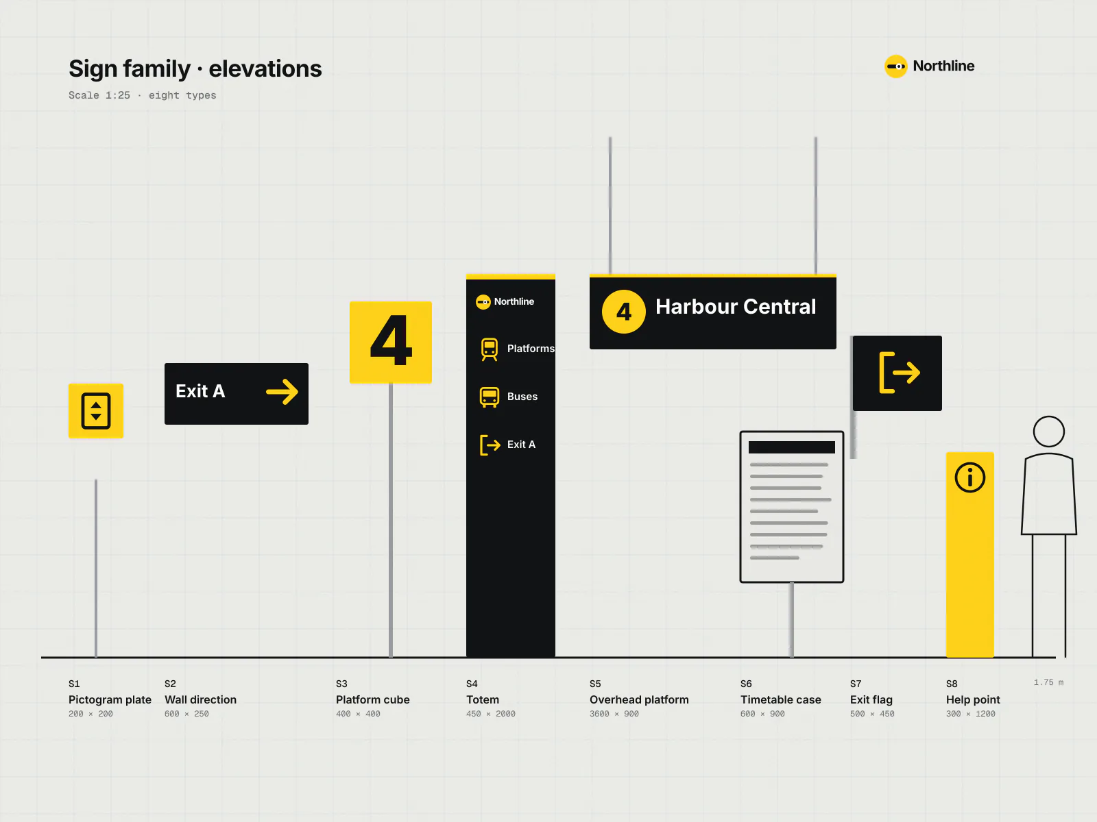
Eight sign types replace the 23 we counted on the line before the project.
What changed, in numbers
- wayfinding questions at staffed desks in pilot stations
- −24%
- stations re-signed in eight months
- 31
- average app store rating after one year
- 4.6
“We expected a nicer font and new colours. What we got was a team standing on our platforms at six in the morning with a stopwatch and a clipboard. The signs are calmer, there are fewer of them, and our staff get asked the way to the bus a lot less.”