Fenwick Health
A patient portal that works for a 78-year-old on an old phone
A portal for twelve clinics that lets patients book, rebook and read their letters without phoning, and a small design system the in-house team of four can maintain.
- Client
- Fenwick Health
- Year
- 2025
- Services
- Research, product design, design system
- Team
- 3 designers, 1 researcher, 1 developer
- Timeline
- 9 months
The brief
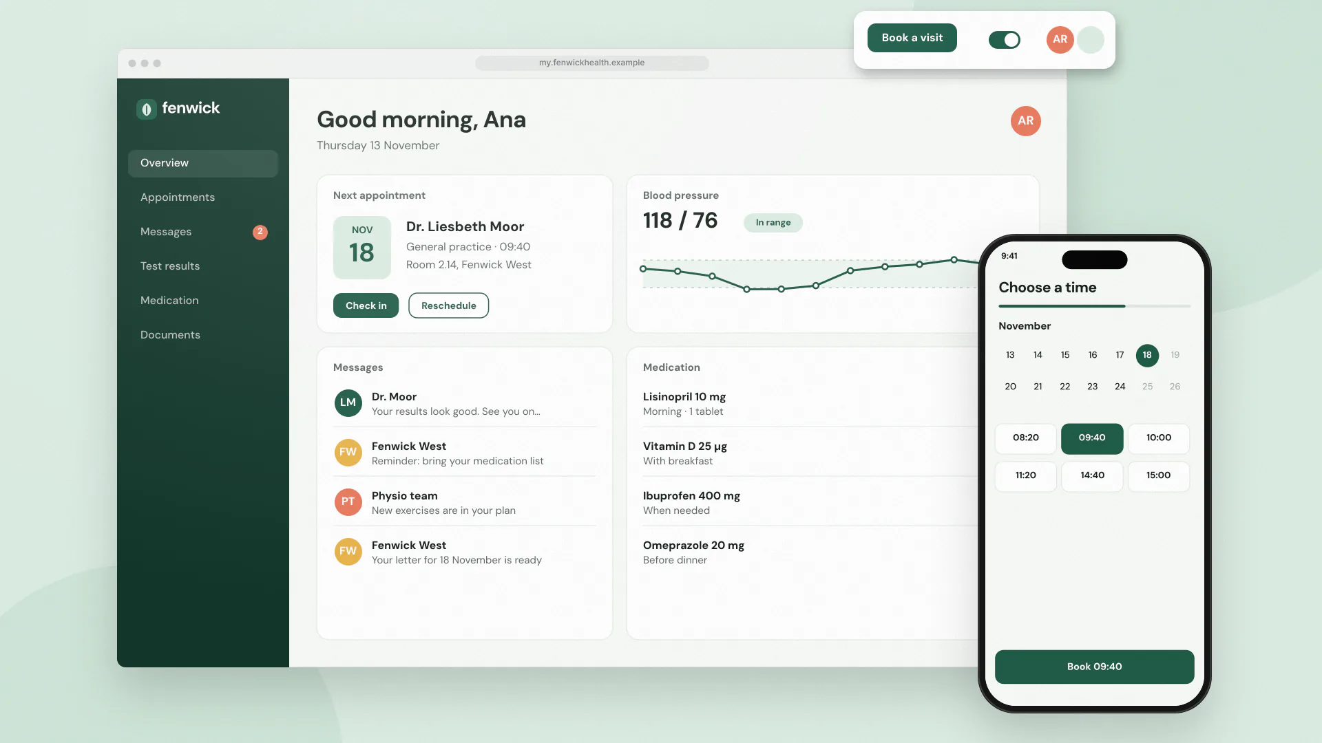
Fenwick Health runs twelve outpatient clinics for physiotherapy, dermatology and minor surgery. In 2024 about 40% of all calls to its booking line were patients moving an appointment, and another large share were people asking whether a letter had arrived. The existing portal could show appointments but not change them, and fewer than one patient in ten had ever signed in.
Fenwick asked us to design a portal that would take those calls off the phone, and to leave behind a design system its in-house team of four could keep using after we left.
What we did
The patient group is older than most digital products assume. Median age is 61, and a quarter of patients are over 75. We ran 24 test sessions across three clinics, mostly in waiting rooms, on patients’ own phones. Several were five or more years old with the text size turned up.
What we learned changed the plan more than once:
- passwords were the biggest barrier, so patients now sign in with a code printed on their letter or sent by text
- people read appointment times aloud to check them, so dates are written out in full (“Tuesday 14 October, 10:30”)
- a calendar picker confused most testers; offering three suitable times first worked far better
- nobody understood the word “portal”, so the service is called “My appointments”
We designed for the largest text setting first and checked every screen at 200% zoom. Colour contrast, focus outlines and labels were tested with screen readers on iOS and Android during design rather than at the end.
The design system came out of the screens rather than the other way round. Once the portal had settled, we pulled out what it actually used: 14 components and about 40 tokens. We wrote usage notes in plain language and paired with Fenwick’s team on the first two features they built with it, so the handover happened in working sessions rather than a document.
What changed
The portal launched in June. Over the next six months, calls to rebook fell by 31%, and 58% of patients signed in at least once. Patients over 75 used it at nearly the same rate as everyone else, which was the result Fenwick cared about most.
An external audit found no WCAG 2.2 AA failures at launch. Since then, Fenwick’s team has added repeat prescriptions and test results to the portal using the system without outside help.
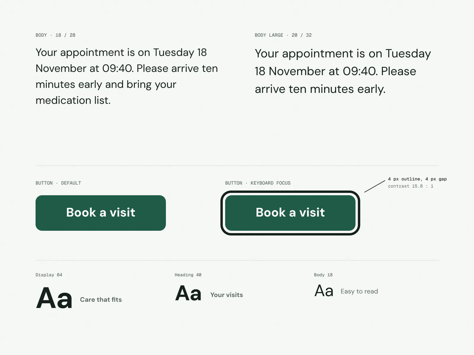
Body text is 18 px with a 20 px option, and every control shows a thick focus outline. 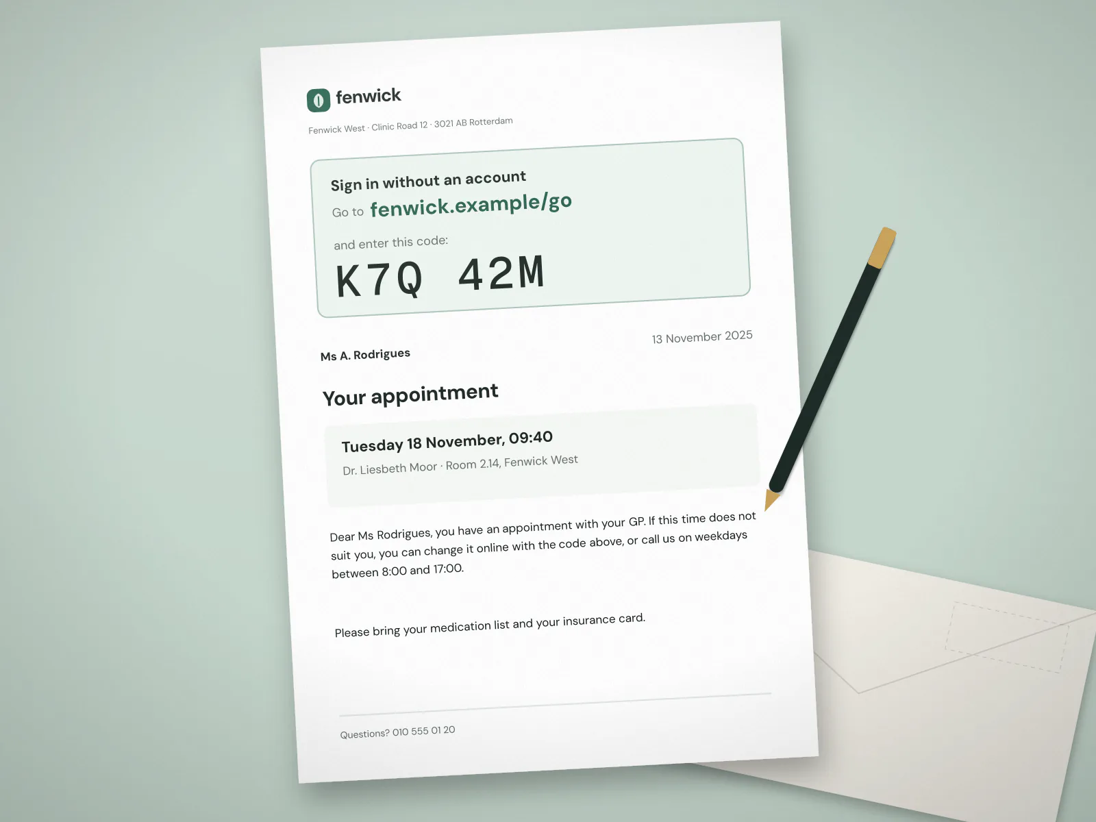
Appointment letters now carry a short address and a one-time code, so patients can sign in without an account first. 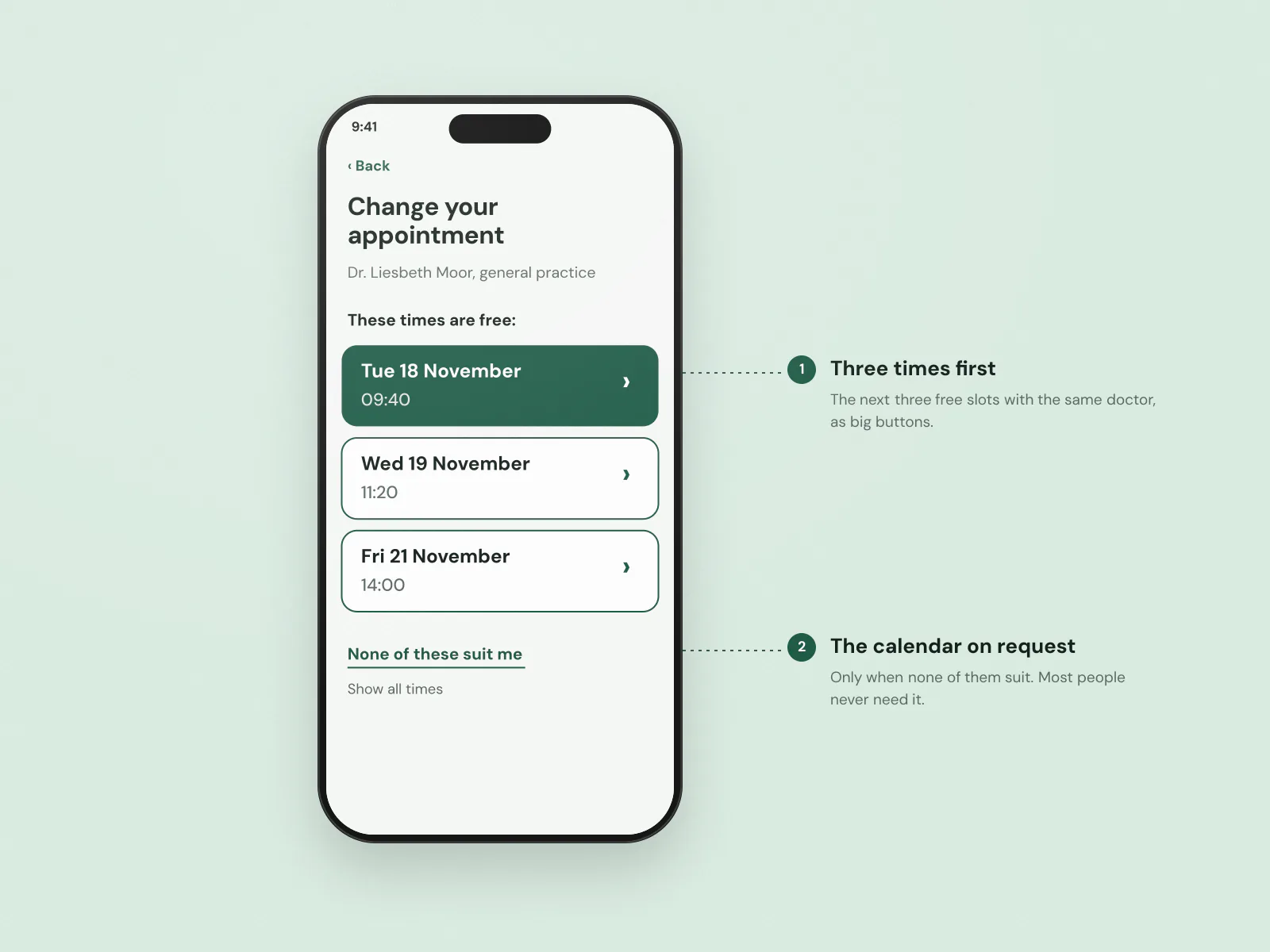
Rebooking offers three times first and a full calendar only if none of them suit. 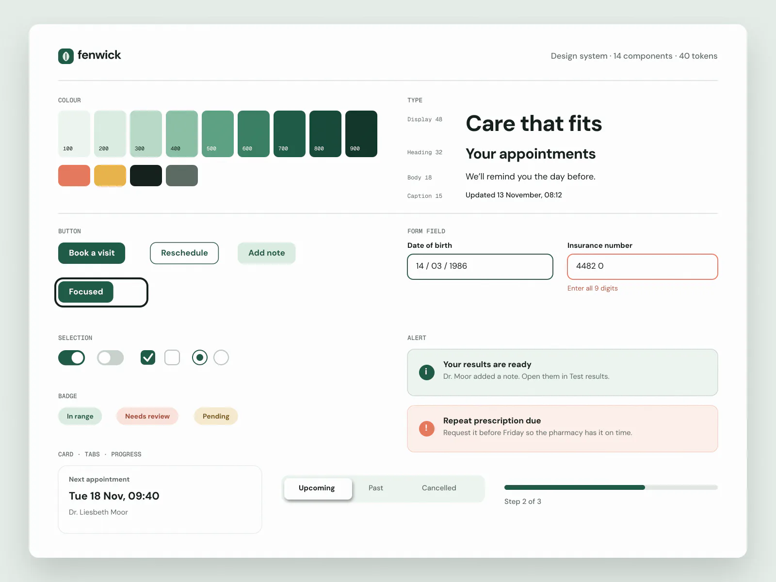
The whole design system fits on one sheet: 14 components and about 40 tokens.
What changed, in numbers
- phone calls to rebook appointments
- −31%
- of patients signed in at least once in six months
- 58%
- passed in an external audit at launch
- WCAG 2.2 AA
“The test sessions with our older patients were humbling. Things we thought were obvious weren't. Corvel kept bringing those sessions back into every design review, and the design system they left behind is small enough that our team actually uses it.”