Tidewater Museum
An exhibition website planned around the visit, not the catalogue
A website for a maritime museum's flood exhibition that answers practical questions first, and keeps the stories for people who want to read on after their visit.
- Client
- Tidewater Museum
- Year
- 2024
- Services
- Web design, content design, development
- Team
- 2 designers, 1 content designer, 1 developer
- Timeline
- 4 months
The brief
Tidewater is a maritime and coastal history museum in a port town on the Dutch coast, with about 90,000 visitors a year. In autumn 2024 it opened Low Water, an exhibition about two centuries of flooding and the people who lived through it. The museum’s main site is run by its parent foundation and changes slowly, so the exhibition needed its own site, ready six weeks before opening.
The curators had written 30,000 words of stories about the objects. They hoped the website could carry most of them.
What we did
We started by reading the museum’s front-desk log for the previous year. Nearly every question was practical: opening hours, whether the building is step-free, whether pushchairs are allowed in the galleries, where to park, and how long a visit takes. Almost nobody phoned to ask about content.
That led to a structure the curators weren’t sure about at first:
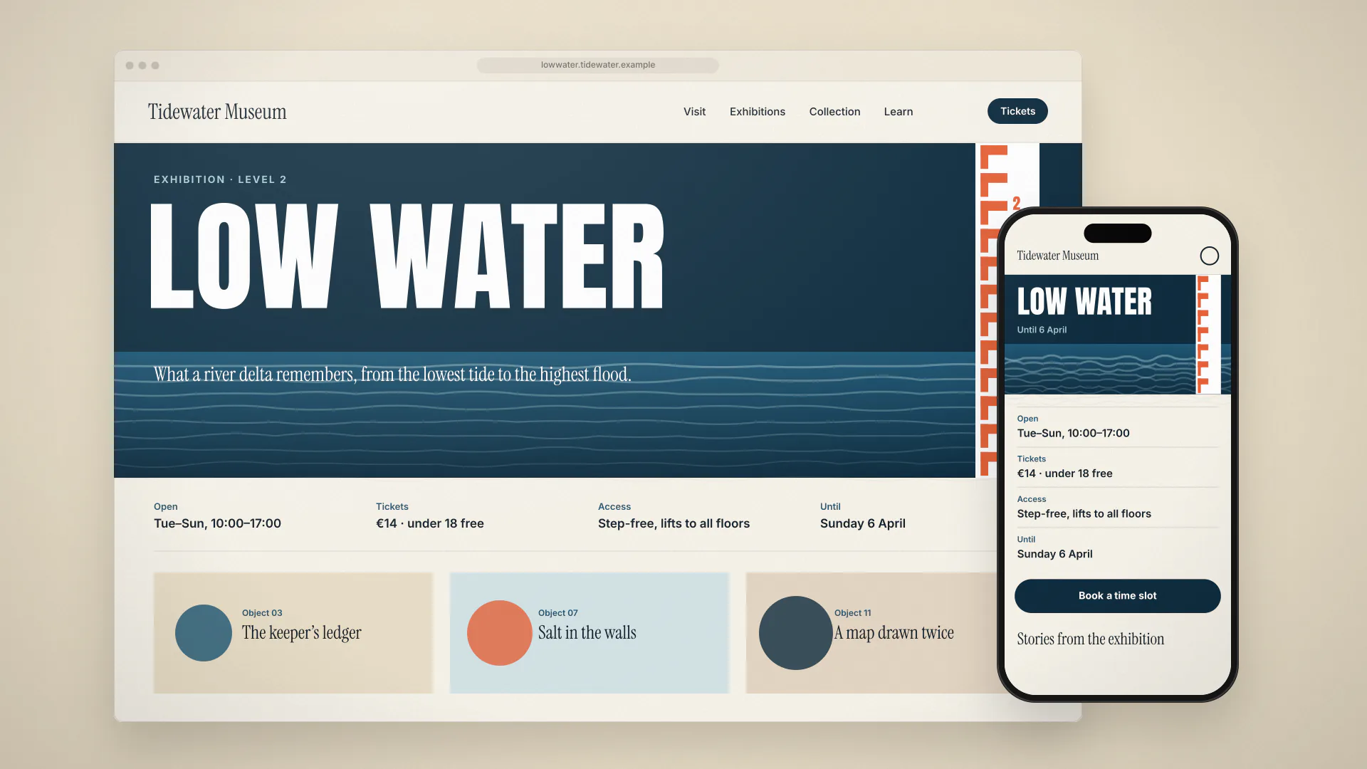
- the first page is the visit page, with hours, prices, access and the length of a typical visit
- tickets can be booked from the first screen on a phone
- twelve object stories sit behind the visit information, each about 600 words with two or three images
- a separate page for schools covers group bookings and a downloadable lesson plan
We cut the 30,000 words to about 8,000 for the web with the curators, story by story. The rest went into the printed guide, which suited the longer texts better. Each story ends with where to find the object in the galleries, so the site works as a companion during the visit as well as before it.
The site is static, with no tracking beyond simple page counts, and is light enough to load quickly on the patchy coastal mobile signal near the museum. We tested on a mid-range Android phone on 3G throughout the build.
What changed
Low Water opened in October. Advance bookings were 19% higher than for the museum’s previous major exhibition, and calls about access and facilities fell by 45%, which freed the front desk at the busiest times.
The stories did better than the curators feared. About a third of visits to story pages happened after visitors had been to the museum, mostly in the evening of the same day. The museum has since asked us to use the same structure for its next exhibition in 2026.
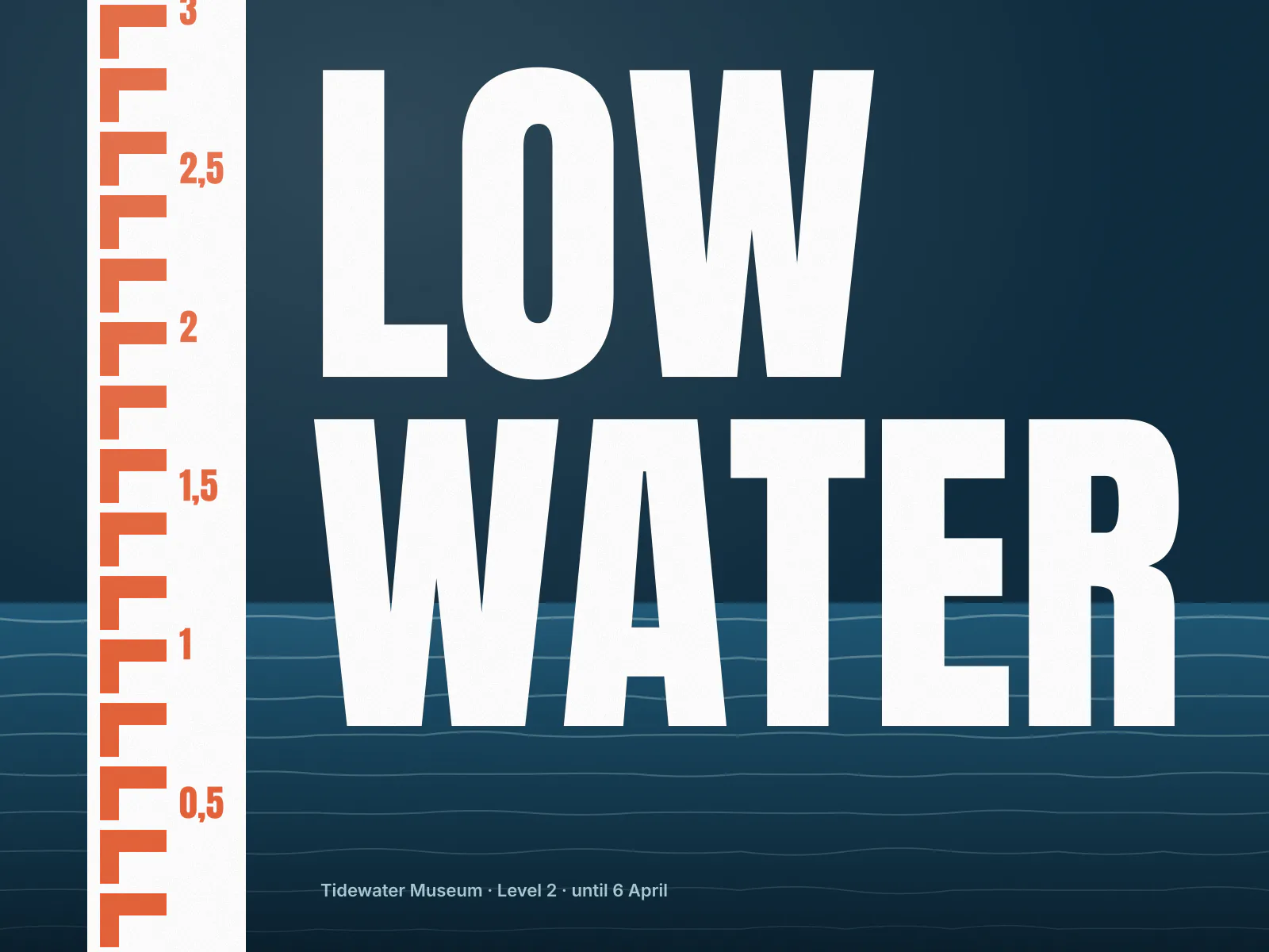
The exhibition title, set against the tide-gauge scale used throughout the show. 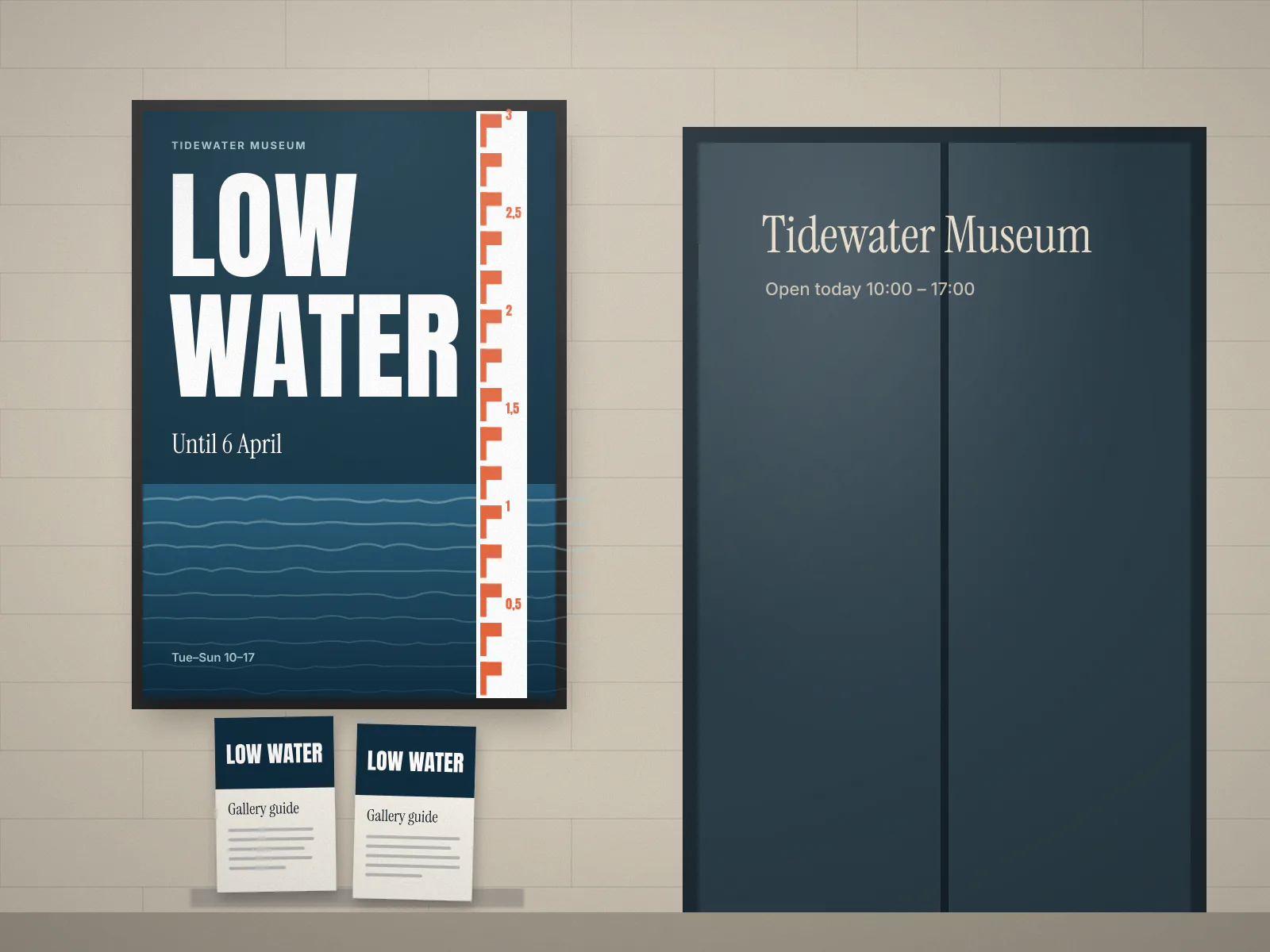
The printed guide and poster share the scale and type with the website. 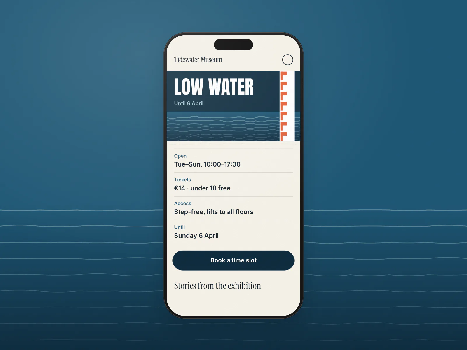
On a phone, the first screen answers when, how much and how to get in. 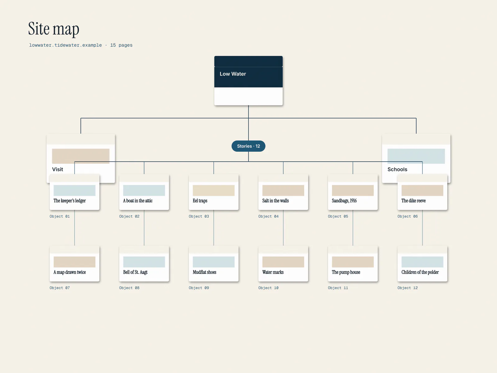
The site map: one visit page, twelve object stories and a page for schools.
What changed, in numbers
- tickets booked in advance compared with the last exhibition
- +19%
- phone calls about access and facilities
- −45%
- median page load on a mobile connection
- 0.8 s
“Our curators wanted the website to be the exhibition. Corvel persuaded us that its first job is to get people through the door with the right shoes and the right expectations. The stories are all still there, and more people read them after their visit than before.”